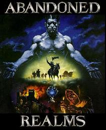
| View previous topic :: View next topic |
| Author |
Message |
marsd

Joined: 16 Jan 2004
Posts: 832
Location: Magewares
|
 Posted: Tue Jan 10, 2006 4:02 am Post subject: Posted: Tue Jan 10, 2006 4:02 am Post subject: |

|
|
| Code: |
<p>All this annoying waffle is just to keep Marsd happy.</p>
<wall of waffle WEEEEEEEEE shoot I'm hungry @_@>
<eats wall of waffles>
<p>Think he is happy yet?</p>
|
Ooh marsd is pretty happy today. Full and contended @_@ |
|
| Back to top |
|
 |
Flying Hampster of Doom
Joined: 16 Jan 2004
Posts: 423
|
| Posted: Tue Jan 10, 2006 8:38 pm Post subject: |
|
|
| I like that most recent one. It is really professional and clean cut. Keep it holmes, for all of us have no idea what we are doing when it comes to site design. |
|
| Back to top |
|
|
_Clifton_
Emissary
Joined: 08 Dec 2005
Posts: 1405
Location: your and you're are not the same. they're, there, and their are not the same. learn to english.
|
| Posted: Tue Jan 10, 2006 10:21 pm Post subject: |
|
|
| i like the idea of pk logs on the main page.. looking good. |
|
| Back to top |
|
|
theobserver
Guest
|
|
| Back to top |
|
|
First-fantasy
Joined: 29 Aug 2005
Posts: 128
|
| Posted: Sun Jan 15, 2006 4:26 am Post subject: |
|
|
| I like that new page, but i was wondering what it would look like with a bit of a margin beneath the burgandy bar and the page content. |
|
| Back to top |
|
|
Jamus
Joined: 18 Jun 2005
Posts: 577
Location: Valour
|
| Posted: Sun Jan 15, 2006 4:37 am Post subject: |
|
|
| Those logs look pretty crappy. Maybe post them on invokation, and link to that, so you don't have to do any editing? |
|
| Back to top |
|
|
theobserver
Guest
|
| Posted: Sun Jan 15, 2006 4:48 am Post subject: |
|
|
| First-fantasy wrote: |
| I like that new page, but i was wondering what it would look like with a bit of a margin beneath the burgandy bar and the page content. |
It would look like this:
http://abandonedrealms.wolfpaw.net/Tork/Test2d.php
I also added my attempt at making a banner.  |
|
| Back to top |
|
|
Vanisse
Immortal
 
Joined: 06 Jan 2006
Posts: 2793
Location: inside a tree
|
| Posted: Sun Jan 15, 2006 6:20 am Post subject: |
|
|
haha what did you use, ms paint? 
i think FF means leaving maybe a line or two of blank space between the bar and the columns of text/picture (if there is one and i just can't see it cause my computer is weird, disregard this comment)
oh and could you possibly crop the rotating pictures so that they're all the same size? the one i just saw looked stretched and waddly. (not waffly) |
|
| Back to top |
|
|
First-fantasy
Joined: 29 Aug 2005
Posts: 128
|
| Posted: Sun Jan 15, 2006 4:57 pm Post subject: |
|
|
There we go Vanisse. Making my babbling make sense. That is what I ment. And darling, that banner has some nice pixelaition going on.  |
|
| Back to top |
|
|
theobserver
Guest
|
| Posted: Sun Jan 15, 2006 8:43 pm Post subject: |
|
|
Well, you are the arty one...go make something better!  |
|
| Back to top |
|
|
First-fantasy
Joined: 29 Aug 2005
Posts: 128
|
| Posted: Sun Jan 15, 2006 10:45 pm Post subject: |
|
|
Okay. So exam week is next week and I've been "studying" all day. Meaning I've had plenty of distraction time.
http://69.246.69.233/arpage.jpg
don't mind the icky jagged burgandy bar that was my fault and I havn't felt like fixing it yet.
and then for just the banner...
http://69.246.69.233/arbanner.jpg |
|
| Back to top |
|
|
Vanisse
Immortal
Joined: 06 Jan 2006
Posts: 2793
Location: inside a tree
|
| Posted: Sun Jan 15, 2006 10:57 pm Post subject: |
|
|
a rather bad shot at it, i'll try again later
 |
|
| Back to top |
|
|
Vanisse
Immortal
Joined: 06 Jan 2006
Posts: 2793
Location: inside a tree
|
| Posted: Mon Jan 16, 2006 12:19 am Post subject: |
|
|
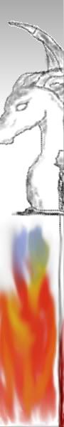
attempt at drawing a side banner 
 |
|
| Back to top |
|
|
theobserver
Guest
|
| Posted: Wed Jan 25, 2006 1:32 am Post subject: |
|
|
Here is more or less the final version:
http://abandonedrealms.wolfpaw.net/Tork/Test2d.php
FinalFanasty made the banner and lines down the left (thanks FF!). I know there are plenty of small things to fix but I dont have the motivation to fix em right now...mainly because I just dont like that page. We deserve better I think. |
|
| Back to top |
|
|
Mendek
Joined: 16 Jan 2004
Posts: 472
|
| Posted: Tue Jan 31, 2006 5:30 pm Post subject: |
|
|
| Magewares no longer loads. Should remove it from Crommunity Sites, |
|
| Back to top |
|
|
Slade
Emissary

Joined: 17 Mar 2004
Posts: 666
|
| Posted: Thu Feb 02, 2006 12:36 am Post subject: |
|
|
| I like the black one better. Its very organized, clear, informational.. Its basic yet classy and looks good. If you needed any more flair you could just some kind of banner where the 'welcome to the abandoned realms' is, or a picture above the intro paragraph or something. But really, the black site is pretty good.. |
|
| Back to top |
|
|
Altheripper
Joined: 20 Oct 2004
Posts: 326
Location: Vancouver, WA
|
| Posted: Thu Feb 02, 2006 6:07 pm Post subject: |
|
|
| Black one looks good to me as well. We need somebody to do up some new artwork for classes and races as well. Then maybe we could have a banner that rotates with the different classes or something. |
|
| Back to top |
|
|
First-fantasy
Joined: 29 Aug 2005
Posts: 128
|
| Posted: Sun Feb 12, 2006 6:06 am Post subject: |
|
|
I like the new one. Its lighter, and in my mind, clearer. But then again, I have a slight obsession with contemporary design even in webpages...So really it could look terrible but there are lines so I'm hooked...
Anyways...There was something else productive I was going to say about this, but its one a.m and I just finished a dew. Little bit spaced. |
|
| Back to top |
|
|
|