| View previous topic :: View next topic |
| Which Banner is most suitable for advertising |
| Banner 1 |
|
7% |
[ 2 ] |
| Banner 2 |
|
10% |
[ 3 ] |
| Banner 3 |
|
82% |
[ 23 ] |
|
| Total Votes : 28 |
|
| Author |
Message |
marsd

Joined: 16 Jan 2004
Posts: 832
Location: Magewares
|
 Posted: Wed Sep 28, 2005 1:56 am Post subject: [IMPORTANT SHIATE] Look! (edited) Posted: Wed Sep 28, 2005 1:56 am Post subject: [IMPORTANT SHIATE] Look! (edited) |

|
|
Update: For those who want flash and more description for AR's banner -> Check this out: http://magewares.net/thear/thear.html
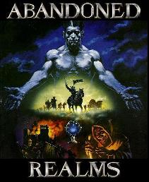
Alright, so I've been trying to do up a banner for Divsky's generous proposition to buy a advertising package for AR.
Here are the links to the 3 banners I put up, give your vote.
After voting give reasons why you voted, then why you didn't vote for the other 2, finally improvements on the banners (either the one you voted for, or the other 2 that aren't as good, in your opinion).
Here is what you do before voting: View each banner in an open window, all by itself. Then think of how it'd relate to you if you were looking around for a new mud, then look back at these 3 "side-by-side".
Banner 1: http://magewares.net/avatar/getimg.php?img=thear.jpg
OR: http://magewares.net/avatar/files/thear.jpg

Banner 2: http://magewares.net/avatar/getimg.php?img=thear2.jpg
OR: http://magewares.net/avatar/files/thear2.jpg

Banner 3: http://magewares.net/avatar/getimg.php?img=thear3.jpg
OR: http://magewares.net/avatar/files/thear3.jpg

------------------------------------------------------------
Banner 4 is not included in voting.. just for commenting & viewing pleasure.
Uhhhhhh edit:
Banner 4: http://magewares.net/avatar/getimg.php?img=thear4.jpg
OR: http://magewares.net/avatar/files/thear4.jpg

Explanation of the banners in general.
Background was a marble archway with elaborate pillars I cropped up and deformed. Still looks pillarish anyway, so hah.
The swords were traced out from photoes of real swords into vector shapes. Gold colurs were just imprints of the photoes.
The bottom right text is dwarven runic, literally spells out (T)he3A3R
T is missing obviously, heh. 3 is the tri-dot colon seperator between the runes. Same font used for Tolkien's Moria runes.
Font used in banner 1-3 "Abandoned Realms" is English Runic. Font in banner 4 was Celtic. So are fonts for the slogans, just different type of celtic.
------------------------------------------------------------
Just for kicks and shits:
Banner 5 is created in suggestion from archat not to use first letter highlighting, hence all "gold" now, which is really a dulled orange. The 3 versions of banner 5 is me trying to make it more/less floaty with the glow in the middle of the banner. Effect is pretty obvious.
Banner 5a

Banner 5b

Banner 5c

Banner 5d has got the bottom runes changed... reason being to try and create the illusion of continuity or whatever. Hah.

The runes spell: Welcome to Abandoned Realms, You'll never be the same.
Last edited by marsd on Sun Oct 02, 2005 3:57 pm; edited 11 times in total |
|
| Back to top |
|
 |
divsky
Emissary
 
Joined: 13 Mar 2004
Posts: 1054
Location: Iowa City, IA
|
| Posted: Wed Sep 28, 2005 1:58 am Post subject: |
|
|
| I personally voted for #1, though I think they all look pretty cool. I've decided against wanting a really cool flash banner. The reason is that muds are really an viable option for almost anyone with a computer and internet access.. . I want advertising for AR to be low-tech. |
|
| Back to top |
|
|
marsd
Joined: 16 Jan 2004
Posts: 832
Location: Magewares
|
| Posted: Wed Sep 28, 2005 2:03 am Post subject: |
|
|
I'm voting for my own banner, how sad. Aha, frankly I have no qualms about adding depth and interactivity into banners, but there's a 36kilobyte limit in the advertising space, so no animated gifs. And as you said, flash wouldn't be 100% compatible with everyone around.
Personally I feel that Banner 3 should be used.
The qualities of low-tech in Banner 1 would probably have divsky's rating as it's in complete greyscale, and the sword used would prolly fit well into medivial scene.
Why I choose banner 3, well I brought in a touch of colour into the banner's otherwise pretty greyscale tone, besides the sword looks cooler even in greyscale :p haha. |
|
| Back to top |
|
|
Louis
Joined: 19 Jan 2004
Posts: 823
Location: Los Angeles, CA
|
| Posted: Wed Sep 28, 2005 2:13 am Post subject: |
|
|
i love all of them marsd
but here are my reasonings behind banner 3
first of all, the gold non-invasive but stand-out gold coloring helps the banner catch the eye of web surfers much better than 1 (which i think is also great). also, i like the letters being centered as much as possible in 1 and 3, unlike 2 (although 2 has a way cool sword hilt as well)
if you would like some constructive criticism, here are a few:
1) play around with coloring or making it so that the LETTERS for abandoned realms don't get downplayed by the color in the sword
2) we need a better slogan than "you will never be the same"
3) love the fonts, but i'm wondering how it would look if Abandoned Realms was spelled out with the font you used for the slogan instead? just wondering how it would look, no idea what would look better
On the whole, AWESOME job. |
|
| Back to top |
|
|
Xazappith
Immortal
Joined: 03 Aug 2005
Posts: 169
|
| Posted: Wed Sep 28, 2005 2:16 am Post subject: |
|
|
| I voted for 2. Like you guys already said, I like the color in the grey, but I like it out of the main view better than right under the words. And I don't like the font used for the title. It looks too roman. Make it more olde english-y |
|
| Back to top |
|
|
divsky
Emissary
Joined: 13 Mar 2004
Posts: 1054
Location: Iowa City, IA
|
| Posted: Wed Sep 28, 2005 2:17 am Post subject: |
|
|
| Btw, whichever banner wins I'm gonna pay for. So be sure to vote. I've already put my vote in. |
|
| Back to top |
|
|
marsd
Joined: 16 Jan 2004
Posts: 832
Location: Magewares
|
| Posted: Wed Sep 28, 2005 2:23 am Post subject: |
|
|
Tis probably draft 1 of a few more to come... gotta meddle around with it a bit, and maybe actually have a few more suggested editing to it before we could settle on one..
By the way, the font in Abandoned Realms used is Runic English... the font in the slogan is Celtic. Eheh it's gonna be confusing 
Last edited by marsd on Wed Sep 28, 2005 2:28 am; edited 1 time in total |
|
| Back to top |
|
|
divsky
Emissary
Joined: 13 Mar 2004
Posts: 1054
Location: Iowa City, IA
|
| Posted: Wed Sep 28, 2005 2:26 am Post subject: |
|
|
| I like the font. Also, I like the little 4-letter runic word in the corner. Although marsd hasn't confirmed this for me, at first glance I thought it looked like "FEAR" |
|
| Back to top |
|
|
Slade
Emissary

Joined: 17 Mar 2004
Posts: 666
|
| Posted: Wed Sep 28, 2005 2:26 am Post subject: |
|
|
I like banner 3 more than the others because its more eye catching.
I don't think any of the 3 really fit though. It needs more color, the all grey isn't working. The font doesn't feel like AR to me. You will never be the same isn't that appealing IMO.
Edit: 5D is the best right now.
Last edited by Slade on Wed Sep 28, 2005 4:10 am; edited 1 time in total |
|
| Back to top |
|
|
Viggs
Joined: 10 Mar 2004
Posts: 383
|
| Posted: Wed Sep 28, 2005 2:26 am Post subject: |
|
|
First off , Thats freaking kick ass of you to pay for one.
I voted for number 2. almost 3 but I like the sword on the right for some reason , right handed?? who knows.
Hella good job
If i had to change on thing it would be the A in Abandoned,, Almost looks like an M to me. then again Im stoned so I might be craving M&M's |
|
| Back to top |
|
|
First-fantasy
Joined: 29 Aug 2005
Posts: 128
|
| Posted: Wed Sep 28, 2005 2:43 am Post subject: |
|
|
I like number one. But I have a thing against gold, so that may be it. I'm also not crazy about the font used for "Abandoned Realms" May I suggest using the color in the text, perhaps in either the Title or the slogan, but not both? That way it would draw focus to the banner and more importantly the mud itself, and not just the picture behind it. I'm partial to dark reds and dark navy blues, but thats just me. But I also know they used rich colors back in the olden days and it just seems fitting to the realms.
I don't know, I think they are all pretty awesome though.
Good work.
~Edit~
I love the text on number four. And I really like coloring on the "abandoned realms" ( Now if it just wasn't gold, I'd be all set. ^_~) |
|
| Back to top |
|
|
LABruinCub
Joined: 30 Jan 2004
Posts: 124
|
| Posted: Wed Sep 28, 2005 5:17 am Post subject: |
|
|
First, thanks in advance goes to Divsky for putting up the cash to pay for the ad. I know those ads aren't cheap, so we all at AR damn well appreciate it.
Second, banner 3. |
|
| Back to top |
|
|
Louis
Joined: 19 Jan 2004
Posts: 823
Location: Los Angeles, CA
|
| Posted: Wed Sep 28, 2005 5:35 am Post subject: |
|
|
out of the initial banners i liked 3,
but of the new ones i really like 5d |
|
| Back to top |
|
|
Esivole
Immortal

Joined: 21 May 2004
Posts: 958
Location: Somewhere beyond the present.
|
| Posted: Wed Sep 28, 2005 10:52 am Post subject: |
|
|
| I chose banner 3, However I liked 5d also more than the rest. |
|
| Back to top |
|
|
Altheripper
Joined: 20 Oct 2004
Posts: 326
Location: Vancouver, WA
|
| Posted: Wed Sep 28, 2005 3:42 pm Post subject: |
|
|
*claps enthusiastically* Excellent idea! Two thumbs up to divsky for his cash and marsd for his creativity.
I vote for number 3, but I definitely like the lettering in 5d better. |
|
| Back to top |
|
|
Quiet Wanderer
Joined: 16 Feb 2004
Posts: 547
Location: Western Michigan
|
| Posted: Wed Sep 28, 2005 3:52 pm Post subject: |
|
|
| 5d gets my vote.. the little 'aura' like around the sword is nice, but maybe, if it wouldn't make it too busy, add in a axe or something vicious looking. Excellent how it is. Props again to Divsky for paying for the advertising. I love the continuous script at the bottom, and the pillar scheme. Excellent job marsd, excellent. |
|
| Back to top |
|
|
Kalist19
Emissary

Joined: 19 Jan 2004
Posts: 1154
|
| Posted: Wed Sep 28, 2005 7:53 pm Post subject: |
|
|
| I like 5d. I think it grabs attention more than the gray/white banners. That's awesome that marsd is making it and divsky is paying for it. That's some dedication, I'll tell you hwhat. |
|
| Back to top |
|
|
Lorne
Immortal
Joined: 20 Jan 2004
Posts: 456
|
| Posted: Wed Sep 28, 2005 8:28 pm Post subject: |
|
|
| I like 5d also, even though I voted for 3. The letters for 5d really stand out, but I'd be happy with any of them. Great work marsd + div. |
|
| Back to top |
|
|
Hamp
Joined: 16 Jan 2004
Posts: 212
Location: New York, USA
|
| Posted: Wed Sep 28, 2005 9:15 pm Post subject: |
|
|
| I'd vote for 5d. |
|
| Back to top |
|
|
Mr. Forgotten
Joined: 18 Aug 2005
Posts: 539
|
| Posted: Thu Sep 29, 2005 12:22 am Post subject: |
|
|
| Yup 5d gets mah vote, if any i like it the best. |
|
| Back to top |
|
|
|