| View previous topic :: View next topic |
| What's you opinion on the page? |
| I like it. |
|
54% |
[ 13 ] |
| I dislike it. |
|
45% |
[ 11 ] |
|
| Total Votes : 24 |
|
| Author |
Message |
xanthas

Joined: 08 Feb 2004
Posts: 474
Location: Atlanta, GA
|
 Posted: Tue Aug 10, 2004 1:19 pm Post subject: New Webpage Design - Demo Posted: Tue Aug 10, 2004 1:19 pm Post subject: New Webpage Design - Demo |

|
|
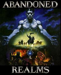
My proposed site design can be found HERE.
Obviously it needs a banner, so look past that blank spot. It's easy enough to modify, manage, and maintain...
This page is just a demo... |
|
| Back to top |
|
 |
Bones V2.0
Joined: 17 Jan 2004
Posts: 295
Location: Universal
|
| Posted: Tue Aug 10, 2004 3:21 pm Post subject: |
|
|
I think it is an improvement.
Any way you can have drop-down menus when you highlight items? (i.e. Mouse hovers over cabals, and it lists them, along with recent cabal news) |
|
| Back to top |
|
|
GodOfWar
Joined: 24 Jun 2004
Posts: 215
Location: Kalifornicatia
|
| Posted: Tue Aug 10, 2004 5:22 pm Post subject: |
|
|
I like it. The layout is good and Dav was saying he wanted to do something about the links on the right side. But I also liked the navigation options when they were up top.
Though I think it looks good, I don't think it's enough of an improvement to warrant a change of the website as a whole. Though it's a bit better, for the most part it's still the same. I think it's a good step in the right direction though.
Still not much in the way of imagery and that's something that would be really helpful in attracting new players to the game. |
|
| Back to top |
|
|
xanthas
Joined: 08 Feb 2004
Posts: 474
Location: Atlanta, GA
|
| Posted: Tue Aug 10, 2004 5:31 pm Post subject: |
|
|
| GodOfWar wrote: |
| Still not much in the way of imagery and that's something that would be really helpful in attracting new players to the game. |
I didn't know images attract players to MUDs. They must be real disappointed when they find out it's all text.
I think a nifty, non Dav made, banner could spice it up a bit. |
|
| Back to top |
|
|
Viggs
Joined: 10 Mar 2004
Posts: 383
|
| Posted: Tue Aug 10, 2004 7:07 pm Post subject: |
|
|
| Seems Bland ,Im sure you can do better, If the web page is going to be updated Spice it up abunch , Its pretty much the same as before just rearranged some |
|
| Back to top |
|
|
Quiet Wanderer
Joined: 16 Feb 2004
Posts: 547
Location: Western Michigan
|
| Posted: Tue Aug 10, 2004 10:04 pm Post subject: |
|
|
| I'll get on using some images and such to make a banner, give me a day, day and a half and i'll post a link to it. |
|
| Back to top |
|
|
GodOfWar
Joined: 24 Jun 2004
Posts: 215
Location: Kalifornicatia
|
| Posted: Wed Aug 11, 2004 12:15 am Post subject: |
|
|
| An animated banner like you see on some of the other sites might be cool. Anything to jumpstart and inspire the imagination. |
|
| Back to top |
|
|
Louis
Joined: 19 Jan 2004
Posts: 823
Location: Los Angeles, CA
|
| Posted: Wed Aug 11, 2004 1:14 am Post subject: |
|
|
| i think its a good looking start. |
|
| Back to top |
|
|
Mendek
Joined: 16 Jan 2004
Posts: 472
|
| Posted: Thu Aug 12, 2004 12:55 am Post subject: |
|
|
| Animated banners tend to be annoying and many of us have anti-spam/pop-up programs or plugins installed to freeze them on load or not load them at all. |
|
| Back to top |
|
|
DropThat
Joined: 30 Jan 2004
Posts: 148
|
| Posted: Thu Aug 12, 2004 6:21 pm Post subject: |
|
|
| so it still works the same as before big deal. its all the artsy crap that makes it so ,much better. a nice looking page like that will kick ars current page looks' ass any day. blue and black straight lined just doesnt say come play me. an image like that does. plus the addition of near full color. |
|
| Back to top |
|
|
GodOfWar
Joined: 24 Jun 2004
Posts: 215
Location: Kalifornicatia
|
| Posted: Thu Aug 12, 2004 9:46 pm Post subject: |
|
|
| Mendek wrote: |
| Animated banners tend to be annoying and many of us have anti-spam/pop-up programs or plugins installed to freeze them on load or not load them at all. |
I think that in all actuality it's the opposite. Most of us Don't have banner blockers, and even if you do, a frozen banner wouldn't be bad for those that don't want to see the animations. If the banner was modified to be animated, the first image should be the standard abandoned realms image to accomodate those people that will automatically freeze them. A banner not loading on the other hand is a different story. It just doesn't really look good when you got that little x takes the square box in the top corner of a missing image.
But as a whole I'm all for the animated banner idea. I've seen them on the mudconnector site, and maybe if we don't put an animated banner on the homepage, one should at least be created for the search engines to link to or something. I check out the competition every now and then, and the banners that pop up on mudconnector are in my opinion cool looking, and visually impressive. Things like that instill curiosity and extra initiative to go check out a game and see what it's all about.
One thing that needs to be remembered is that not everyone has the same level of imaginative capacity. Some people need visual stimulus to help them associate images to words(which is pretty much all we have within the mud). If it wasn't for the little animated knights fighting on the page oh so long ago, I don't think I would have even tried this mud out in the first place. It was just that one little thing that made me curious enough to check out the rest of the site, and the images, especially the one of the shaman on the race/class pages, piqued my interest enough for me to make the effort of the whole mud client download/charachter creation process that got me started on the game in the first place. Granted it's chronic induced powers of imagination that got me hooked in the long run, but while cheezy to some, something as small as an animated knight fight is the reason I'm here today, annoying you all with countless posts and bad ideas.  |
|
| Back to top |
|
|
xanthas
Joined: 08 Feb 2004
Posts: 474
Location: Atlanta, GA
|
| Posted: Fri Aug 13, 2004 1:39 am Post subject: |
|
|
| GodOfWar wrote: |
| If it wasn't for the little animated knights fighting on the page oh so long ago... |

  
left: louis
center: davairus
right: ramod
your typical chimp killing
|
|
| Back to top |
|
|
Davairus
Implementor

Joined: 16 Jan 2004
Posts: 10351
Location: 0x0000
|
| Posted: Fri Aug 13, 2004 2:33 am Post subject: |
|
|
| Nah, you got that wrong. Ramod rolls out Kalist for fighting the big guns. Need a spongebob squarepants there. |
|
| Back to top |
|
|
GodOfWar
Joined: 24 Jun 2004
Posts: 215
Location: Kalifornicatia
|
| Posted: Fri Aug 13, 2004 2:39 am Post subject: |
|
|
Thats friggin priceless!!!!   |
|
| Back to top |
|
|
divsky
Emissary

Joined: 13 Mar 2004
Posts: 1054
Location: Iowa City, IA
|
| Posted: Fri Aug 13, 2004 4:15 pm Post subject: |
|
|
| Not enough pictures of naked elves. |
|
| Back to top |
|
|
a_man201

Joined: 29 Mar 2004
Posts: 121
Location: Thunder bay, Ontario
|
| Posted: Fri Aug 13, 2004 7:49 pm Post subject: |
|
|
| I think its a cool looking webpage it's easy to see things and you don't need to search the entire site. |
|
| Back to top |
|
|
Mendek
Joined: 16 Jan 2004
Posts: 472
|
| Posted: Fri Aug 13, 2004 10:22 pm Post subject: |
|
|
| Naked geeky elves? |
|
| Back to top |
|
|
|